Promotional Material

Obviously, the logo is the first thing. I mean, I think the logo is good, it has an essence of the previous incarnation, but puts it own spin on it. It looks more like the original PPG logo (back when it
was a mere Oh Yeah! Cartoons short). Feel free to disagree however.
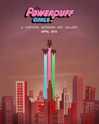
Now, you may think that this is all the promotional material, and I am pretty sure I have covered all of it, if I haven't drop down a comment and inform what I have missed!
You never know, I may have missed one thing.
Show Clips
Watch them here!
- Two new promos you may not have seen, starring Him! Mojo Jojo! Princess! Loads of new villains!
These promos are both good, I like the girls flying out of the window still, and many things have been kept. Quite a lot of new things, like uhm, that giant blue teddy thing? I feel like they aren't a bad thing because, as seen in "Don't Call Me Princess!" (The episode clip), they do still fight with there fists and they NAIL the villains still, I do not feel like those things will be permanent and they may sparsely use gadgets.
The design looks good, the new VAs have won me over in these promos, I like a lot of the elements, however what was Buttercup throwing at Princess? Was it just me or did it look like a gem? I hope that the reason they adding in the new element isn't because they wanna cash in on Steven Universe because they are different shows.
I really like the fight scenes at night, compared to day because I feel they animate it a bit better, like it's not as in your face.
Now, I like this clip, yes it seems very, "FEMINISM!" but no. That's an out of context clip and considering the villain, it's like this. I was worried at first, but Equal Fights was an episode of the old series AND, of course this episode will have some ounces of feminism in.
Now, this clip had animation, duh. I didn't like the villain, it rubbed me the wrong way due to the design in the first place, anyway, it does seem Clarency, but I do not care about that, it was the throw, it wasn't fast paced enough, like, yes cringe comparison to the original, the original was fluid and it amped up the throwing, and there were more frames drawn?
I don't really know, but it looked better back in 1997, but this is different, so obviously this will do better in some aspects that the original show failed at.
Show Pics
These pictures are separate from the promotional material.

Bubbles convinces the Professor to test his new transmogrifying ray on her new friend, Donny the Pony in an effort to help him become the unicorn he's always wanted to be, but when it turns Donny into a monster instead, she must stop him before he destroys Townsville!
Creepy.
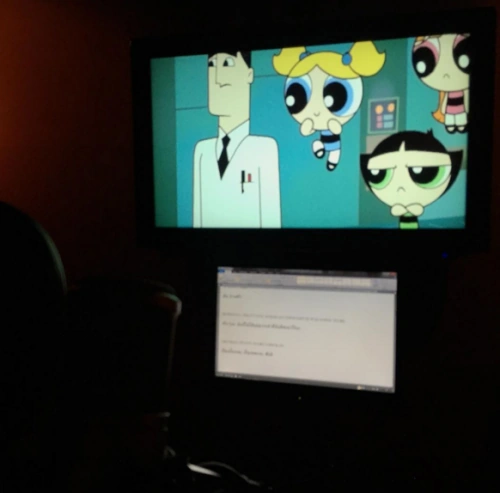
Credit to respective image owners, btw.
Intro
"Don't get hyped yet. The intro may be posted on Monday, doubting it, however."
Darn, I was wrong!
The intro is very interesting, really. Check it out!
No comments:
Post a Comment